Monday, 26 November 2012

Points on Making Good Design

Watching this weeks Coursera lectures for Design: Creation of Artifacts in Society, our professor Karl T. Ulrich really got it bang on with his three simple points for 'How to Create Beautiful Artifacts.'.
  • Work hard.
  • Take care & notice (or Be aware)
  • Iterage again and again
I may argue that this would sum up how to be good at anything.

Thursday, 8 November 2012

Choosing the best

I love this post "The Best" by Dustin Curtis.  Do your research, think about design and you will find a product that solves your problem.  Design is important.
It’s better to have a few fantastic things designed for you than to have many untrustworthy things poorly designed to please everyone. The result–being able to blindly trust the things you own–is intensely liberating.
This also rings true as I learn new design techniques and ways tho think through a problem during Coursera's Design: Creation of Artifacts in Society.

I found Curtis's post through Daring Fireball by John Gruber which I regularly read.

Thursday, 1 November 2012

Design Quote: Malcom Gladwell

"By embracing the diversity of humans being, we will find a sure way to true happiness."

Malcolm Gladwell speaking about Howard Moscovitz at TedTalks 2004

Tuesday, 30 October 2012

First Week of Coursera, Design: Creation of Artifacts in Society

My first week with Coursera's on-line university course Design: Creation of Artifacts in Society was difficult but ended up being incredible rewarding.

Coursera is an on-line university completely free, taught by real professors and linked to well respected universities in Canada, the United States and around the world.  It is completely free.  Yes, free.  However, you will not get accredited for it.  Right now it is for the joy of learning by some of the best professors out there.

I enrolled because I get very little design experience in my everday life which is a direction I strongly want my career to go in.  I was hoping this course would get me excited and get my mind thinking about design again.  The only design course offered is Design: Creation of Artifacts and is being taught by Karl T. Ulrich from the University of Pennsylvania.

My life is like everyone's.  It is busy.  I have a full time job as a Landscape Architect, am married, have a five month old little girl and a dog who gives me dirty looks if we don't walk her twice a day.   Coursera says this course is a 5-10 hour work load per week.  That frightened me.  I almost didn't enroll.  I eventually thought, if I can't do it, I un-enroll and nothing lost.  Here is how the first week went.

There were several videos to watch which is how the course is presented.  At most a video is 12 minutes long or so.  These were easy to watch and informative.  There is also a free textbook as suggested reading by Ulrich, (download it here).  The first two chapters did not take long to read and reinforced the information from the video.  It is basic 101 design information that is interesting.  Then I took a look at the assignments and become frightened and thought they were below me.  There were four assignments, all fairly simple well thought out assignments to get you thinking about design problems.  Why was it then after one day I debated dropping this course?  It was my wife who pointed it out to me.  I had become a lazy thinker.  I was afraid to take a chance and think outside my comfort level and I didn't realize it.  And this is work I enjoy doing.  This course is exactly what I needed and I almost gave up before beginning.

So I hunkered down.  I watched ones less tv show three weeknights and took a couple hours on Sunday to finish all my assignments.  I still had time for my wife and daughter, for the dog and a small social life, and yes a little tv.  Am I happy with all my assignments?  No.  I think I could have done better.  But did I do what I could with the time I have?  Yes.  And it made me realize my mind has become lazy when it comes to thinking more than then required..  I love design.  I want to be doing design work everyday.  However, for a while I have not had the opportunity to do this in my career or in my hobbies and it changed me.  This course made me realize this (more so my wife, thank you!).  With a little shift in mind-set I'm staring to see the assignments not as burdens but as challenges to think differently again.

I am sticking with Coursera for as long as my daily life will allow it.  Television will be still be there when it's done.  I truly want to finish this course and think it is a great tool to get me thinking critically again.  One week down.

Wednesday, 2 May 2012

Design Inspirations

Milton Glaser

...The three cardinal factors of design are the following:  Who is the audience?  What do you want to say to them?  How do you say it effectively?  If you don't follow this sequence, you're always going to make some terrible mistake.
From 'Design Dialogues' by Steven Heller and Elinor Pettit.  


Milton Glaser is a very well known graphic design, illustrator, typographer, art director and educator.  


Another tidbit from the interview, a Chinese saying:


...Everything at its fullness is already in decline... 


And to continue on the same trend, a couple weeks ago I was lucky enough to attend a conference put on by Sheridan's graduation Illustration class, Illustrationism.  Here are just a few of the things that came up I found interesting and useful in the process of building a career.


Always remember the two P's when you're building your career:  Perseverance and Patience.

Inspiration is for amateurs.


And a don't be afraid of risks.


Tuesday, 13 March 2012

Jonathan Ive on Being a Designer.

Ive, I mean Sir Jonathan Ive, recently gave an interview to The London Evening Standard. Ive's opinion on being a great designer:
It is so important to be light on your feet, inquisitive and interested in being wrong. You have that wonderful fascination with the what if questions, but you also need absolute focus and a keen insight into the context and what is important - that is really terribly important. Its about contradictions you have to navigate.
Full interview here. Ive is the well known and fairly publicly quiet designer behind the Apple products for over the last ten years.

Tuesday, 6 March 2012

Dieter Rams' 10 Principles of Good Design


From Core77

While reading about Jonathan Ive, the designer behind most of Apple's products, I learned that a big influence of his was Dieter Rams.  Rams was trained as an architect but became an industrial designer working many years at Braun creating numerous iconic products we recognize.  Later in his career Rams created the ten principles of good design.  


Good Design is:
  1. Good design is innovative.
  2. Good design makes a product useful.
  3. Good design is aesthetic.
  4. Good design makes a product understandable.
  5. Goop design is unobtrusive.
  6. Good design is honest.
  7. Good design is long-lasting.
  8. Good design is thorough, down to the last detail.
  9. Good design is environmentally-friendly.
  10. Good design is as little design as possible.

Now what does this have to do with landscape Architecture?  Although it seems Rams orientated this towards product design, I truly think these principles will carry over to all design, including landscape architecture.  Good design is universal.  


I won't go into detail here about each principle, you can read more about Rams on his principles on Wikipedia or see more of his products all over design blogs such as Core77 (Where I grabbed the photo from), product pages that are still for sale and even a Flickr group.  


I'm going to keep my eyes open for Landscape Architecture examples that closely relate to the principles and keep you updated.


I will leave you with one picture of a radio he designed.  It is clean, distinct and I'm sure very easy to use.  

G.

RT 20 superHet VHFand medium wave radio, 1961


DID is Back!

So my hiatus was a little longer then I expected.  A LARE exam, then Christmas, and then catching up with everything.  The blog was on hold much too long.  But now the posts are starting up again, starting right after this.  


I'm gong to try to post at least once a week.  Let's start there and see what happens.  One good thing, I have passed on all my LARE exams, and that is good.  It is one less thing to worry about.  


G.

Wednesday, 9 November 2011

DID on Temporary Hold - Blame the LARE

It's study crunch for the LARE again, so I haven't had time for any posts.  I'll get things back on track mid December.

Here are some of my thoughts right now...

Design with Dieter Ram.
Just finished a Olmstead Biography.
Urban Planning and Landscape Architecture.
And lots of interesting, inspiring photos.

UPDATE:
Just watched this video with Khoi Vinh on design and grids. This subject is important and needs more thought with landscape architecture.

http://thecolormachine.com/khoi-vinh-on-the-grid/

Monday, 3 October 2011

Weekly Image Roundup

I had big plans this week for an Arts and Crafts post (among other interests) this week and then the week just disappeared. Between a busy week at work and at home I'm not sure where the time went. Please stay tuned and check back later. I have vowed to myself that I will keep this blog up for myself and for any reading. Please add me to your RSS feeds and I'll keep it up on my end.

After all that said, unfortunately the week's image roundup is short as well.  But still good stuff!  Here's this weeks Image-Roundup.

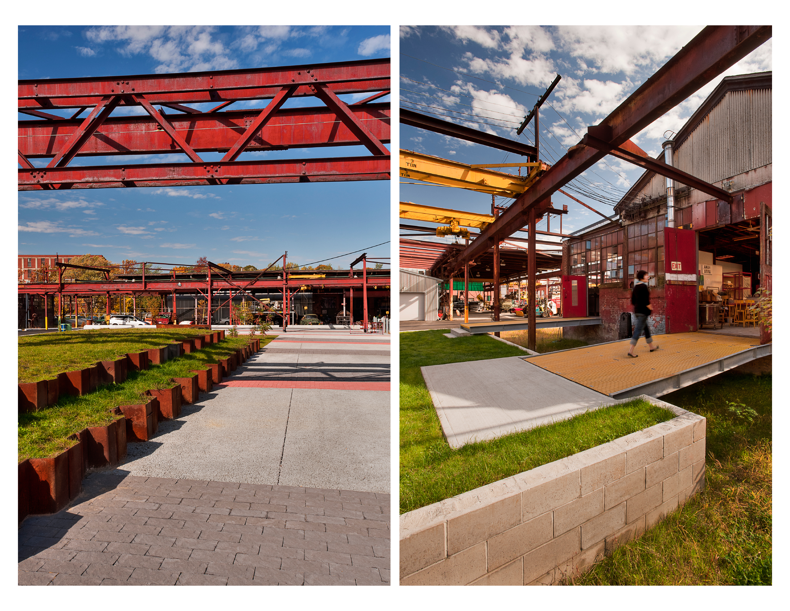
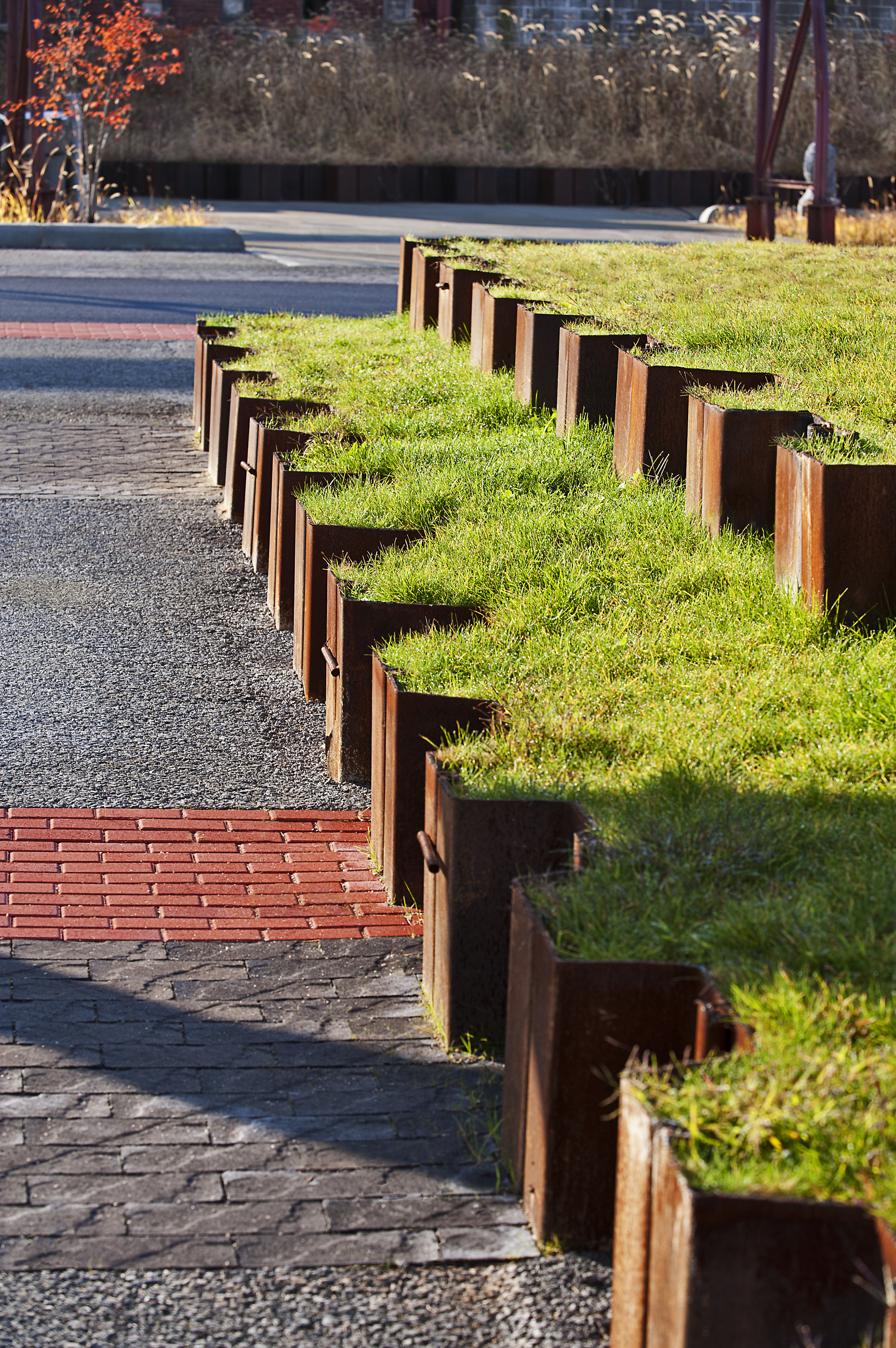
Because of the short week I'm posting two from this recent Honour Award winner from the 2011 ASLA Awards.  The Steel Yard by firm Klopfer Martin Design Group.  I love this stepped lawn using the industrial steel remnant of the site.  This design idea reminds me of other great parks from industrial lands such as Gas Works Park in Seattle.  Check out the ASLA page here. 


I'll be going through this years ASLA winners in more detail soon to pull out the great details on the projects.

And finally, I did say it was a short week, an illustration for brewing company.  What made me pull this out is not so much the image, but the drawing technique made to look as the image is on burlap or a course paper.  It reminds me how much the medium can change how something looks.  What would an image look like on steel, or concrete, or glass.  The same idea can be created many different ways with different materials.  Something I try to keep in my mind.
 

Have a great week.

G.

Sunday, 25 September 2011

Weekly Image Roundup

The Friday Roundup is changing to the Weekly Image Roundup.  I never seemed to be able to get the images up in time, and besides, I'm still finding great images on Friday that never make the cut.

So here we go...

This weeks pick.  My favourite is this water access to Jack Evans Boat Harbour, designed by ASPECT Studios.  Repeating patterns of concrete forms creating steps to the water.  Really nice.  Reminds me a little of the water access at False Creek Olympic Village in Vancouver.

And here's the rest of last week's for your visual interest!  First the directly related LA items.

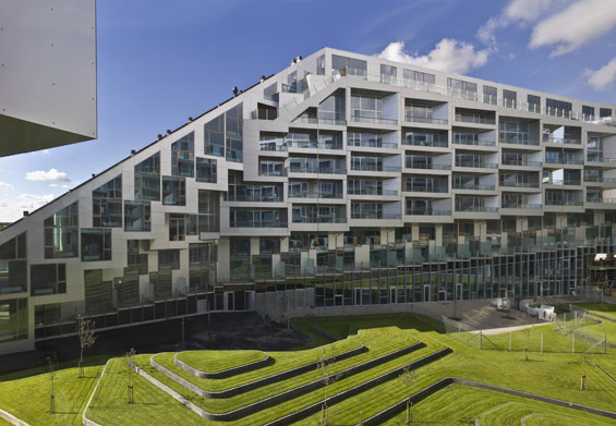
Some contour forms from Denmark.

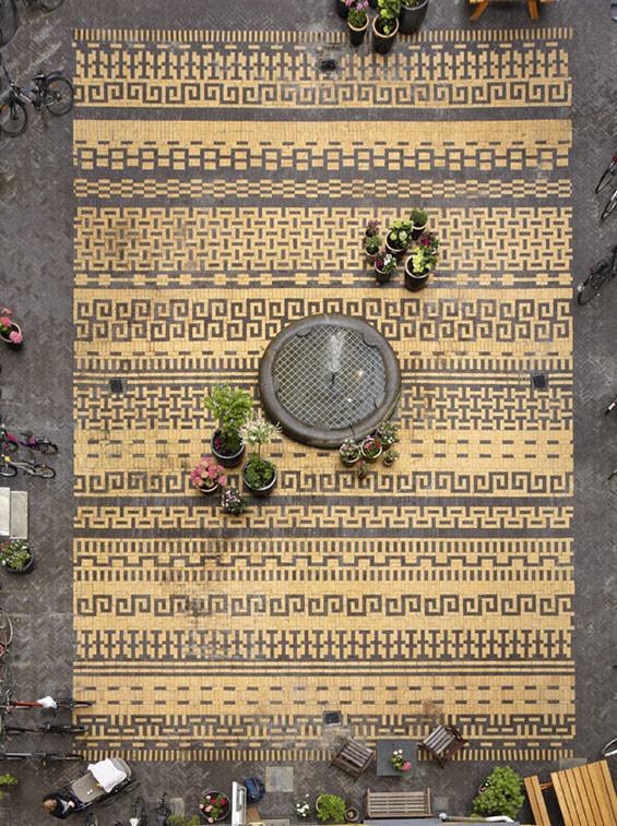
Great intricate paving pattern from a courtyard in Copenhagen.

Amazing bench by artist Alexandre Moronnoz in France.  He has another bench with is also pretty amazing here.

Next, the broader design range.  


Right, work by artist Dolan Geiman This cutout is a technique that can be easily used for signage features.  It reminds me of signing in the Mount Pleasant Square in Brampton, shown to the left, and below.  I'm thinking of different materials behind the cutout could really make things interesting.

And a few more.

And.

Many of the links this week were from World Landscape Architecture and Design Sponge.  Two of my sources for a lot of good stuff.

All images old and new are here.   Have a great week.

G.

Wednesday, 21 September 2011

Paving Patterns

I am very weak towards modern clean pavers.  Large grey pavers with long clean lines constantly draw me in.  However, I'm starting to open up to intricate paving patterns.  It make's me think of Laurie Olin's paving designs for his large plazas.

 Here's one from Seattle.  

And one from his newer projects, Simon and Helen Director Park in Portland.

I remember Olin explaining in a lecture how he found inspiration for these patterns from woven baskets in his office.  

I've been getting a lot of inspiration from other mediums that make me want to try paving like this.  I haven't decided if it could be considered dated or not.  Or maybe it's time for it to come back.  Or more likely it never went out of style.  It would be a great contrast to a simple modern paving scheme, using both in the same project.  Here are some of the images that make me think 'paving pattern'.  Maybe one day I will get the chance.


These three are from Design Sponge where I constantly see interesting stuff.

UPDATE


Found this amazing paving for a courtyard.  Very intricate paving.


Sunday, 18 September 2011

Universal Design

I am a great believer in universal design.  The design principles for all design is the same.  Look for these in graphic design, furniture, industrial design, interior design, architecture and landscape architecture.  Know design.  Continue to learn design for your full career and look towards all creative industries for inspiration.  I try to follow this simple rule of mine.

Take the new EQ3 catalogue I was recently flipping through.  This couch drew my eye.

Along with the clean lines which is a person favourite, it made me think about proportions.  What works?  As always there's the golden rule of thirds that is a good one.  It's a quick sketch but here's a breakdown of the some of the lines that drew my eye.  
I'm not even going to touch the symmetry of the couch.  For another day.  But let's take those lines and transform them into something that landscape architects will design.  A bench.  Here's a quick sketch of a bench that I've seen around.  I've also seen this design as a coffee table.

 Clean lines broken down into thirds to make a clean good looking bench.  The bench could be even closer to the couch if the arms were pulled to edge and maybe a back was added.

Find these universal design principles everywhere.  It will make a difference in how you look at design.

Friday, 15 July 2011

Friday Image Roundup

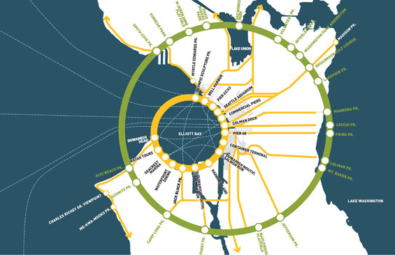
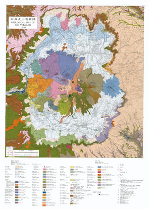
Lots of good stuff this week, but my favorites are these info graphics.  It can be such a fine art to make good looking diagrams or drawings that also convey the information you want to get across. 

Here's my favourite for the Seattle Waterfront Park Design by James Corner Field Operations.  I especially  like simple colour scheme.


And here's a great volcano map image.  Feels like it's ready to frame and hang on the wall.


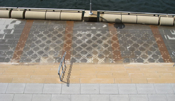
This came in a close second.  I like patterns in the landscape and using them in such an ingenious way.  I want to be able to do something like this one day.  It's by PEG  who have done similar work like this with planting patterns.  Also very cool.


And here's the rest of the inspirational mix for this week.  Have a great weekend.


Wednesday, 13 July 2011

Unexpected Influences for Landscape Details

A co-worker pointed out to me recently the interesting similarity in the Landscape Forms product 'Show' in their Metro Line with the iPhone.  Take a look.


I can't say if the iPhone did influence that line of products for Landscape forms, but it is an interesting comparison, and something I hadn't thought of before.  A small digital smartphone influencing large common objects in the landscape.  Looking at it now, it makes sense.  Smart phones are becoming the single most used object in a person's life.  If we are used to and comfortable with a form, than we will be comfortable when we see a similar form in the world around us.  And I bet it won't be long until that subway or transit map is interactive becoming essentially a very large smartphone with one app, Maps. 

I'm keeping my eyes wide open for patterns in design influence from now on. 

Sunday, 10 July 2011

Bending Wood

Love this chair by Sara Rowghani. Bending wood on a project usually means custom and expensive which means it's not often done. To add to this most woods wear quickly outside so a hardwood like ipe is best which is next to impossible to bend (a word on that in a later post).  Custom benches are always fun to design if you get the chance.

C.G.W.C.D
Sequence of how it's made there


Originally seen at Design*Sponge.

Friday, 8 July 2011

Friday Image Roundup

Here's the roundup.  It's a toss-up for my favourite between the High Line Phase 2 bench.  (I was three weeks too early visiting New York to see this section), or the concrete speakers.  They remind me of how good architectural concrete can look in a space if done well.


I had the chance to visit Sugar Beach in Toronto which was great to see.  I'm going to actually get to breaking down details soon and Sugar Beach will be on the list.  So will Sherbourne Park which I visited as well.


I think there should be more everyday items on the street like this news paper box.  Although this is for a competition, it could easily be made a regular occurrence.  The hydro boxes in Vancouver were sometimes wrapped in images and it was a great little feature.  Hurry up Ontario and get on it.


And one last one for awesome's sake.  This is a post card!  You grow!


I collect all my images here.  Happy Weekend...

And congratulations to Margaret & Joe who are getting married this Saturday.  Two great Landscape Architecture Guelph Grads.

Thursday, 7 July 2011

Revitalizing City Communities with Parks - ASLA

A quick little animation explaining how a small park can revitalize a neighbourhood.  The animation of the park coming to life is a little exciting.  It's great seeing a space take life which reminds me how fun it is to help design spaces just like it.

The ASLA are doing a lot of good initiatives to educate and achieve change.


Revitalizing Communities with Parks from ASLA on Vimeo.


Originally tweeted by planet forward from PBS.

Tuesday, 5 July 2011

Design periods

I've been trying to come up with definitive periods for design movements and who knew it would be so difficult.  I want to relate this different periods to a weekly post about Landscape Architecture and Details within each period.  I'm slowly working on it.  Here's the list that I have started, although it is taken directly from Rejuvenation Hardware it's a starting point.


Victorian - 1870-1915
Period Basics - 1895-1950
Arts & Crafts - 1900-1920
Colonial Revival - 1903-1935
Classic Revival - 1910-1935
Old World - 1920-1940
Art Deco - 1925-1950
Mid-Century Modern - 1950-1970
Industrial - 1890-1930


This is definitely a beginning.  Feel free to get on the virtual horn and comment to add periods. This is the start of the guide to look at Landscape Architecture details through the ages.


More References I found


Architectural Style
Art Movement

Friday, 1 July 2011

Friday image roundup

I want to make this a regular Friday thing. Here's a few of the images I have collected over the last week about Landscape architect and design that I have found interesting. I use Pinterest. You can find all my pinnings at Pinterest.com/g2thet.

Here is the weeks best.

Absolutely love this chair from Loll Designs.

These rockers and other chairs by Loll were all over the patio in Bryant Park in New York.


And here are some odds and ends that I found.  Check out the detail on that door knob.


Have a great weekend.