So my hiatus was a little longer then I expected. A LARE exam, then Christmas, and then catching up with everything. The blog was on hold much too long. But now the posts are starting up again, starting right after this.
I'm gong to try to post at least once a week. Let's start there and see what happens. One good thing, I have passed on all my LARE exams, and that is good. It is one less thing to worry about.
G.
Tuesday, 6 March 2012

Wednesday, 9 November 2011
DID on Temporary Hold - Blame the LARE
It's study crunch for the LARE again, so I haven't had time for any posts. I'll get things back on track mid December.
Here are some of my thoughts right now...
Design with Dieter Ram.
Just finished a Olmstead Biography.
Urban Planning and Landscape Architecture.
And lots of interesting, inspiring photos.
UPDATE:
Just watched this video with Khoi Vinh on design and grids. This subject is important and needs more thought with landscape architecture.
http://thecolormachine.com/khoi-vinh-on-the-grid/
Here are some of my thoughts right now...
Design with Dieter Ram.
Just finished a Olmstead Biography.
Urban Planning and Landscape Architecture.
And lots of interesting, inspiring photos.
UPDATE:
Just watched this video with Khoi Vinh on design and grids. This subject is important and needs more thought with landscape architecture.
http://thecolormachine.com/khoi-vinh-on-the-grid/
Monday, 3 October 2011
Weekly Image Roundup
I had big plans this week for an Arts and Crafts post (among other interests) this week and then the week just disappeared. Between a busy week at work and at home I'm not sure where the time went. Please stay tuned and check back later. I have vowed to myself that I will keep this blog up for myself and for any reading. Please add me to your RSS feeds and I'll keep it up on my end.
After all that said, unfortunately the week's image roundup is short as well. But still good stuff! Here's this weeks Image-Roundup.
Because of the short week I'm posting two from this recent Honour Award winner from the 2011 ASLA Awards. The Steel Yard by firm Klopfer Martin Design Group. I love this stepped lawn using the industrial steel remnant of the site. This design idea reminds me of other great parks from industrial lands such as Gas Works Park in Seattle. Check out the ASLA page here.


I'll be going through this years ASLA winners in more detail soon to pull out the great details on the projects.
And finally, I did say it was a short week, an illustration for brewing company. What made me pull this out is not so much the image, but the drawing technique made to look as the image is on burlap or a course paper. It reminds me how much the medium can change how something looks. What would an image look like on steel, or concrete, or glass. The same idea can be created many different ways with different materials. Something I try to keep in my mind.

Have a great week.
G.
After all that said, unfortunately the week's image roundup is short as well. But still good stuff! Here's this weeks Image-Roundup.
Because of the short week I'm posting two from this recent Honour Award winner from the 2011 ASLA Awards. The Steel Yard by firm Klopfer Martin Design Group. I love this stepped lawn using the industrial steel remnant of the site. This design idea reminds me of other great parks from industrial lands such as Gas Works Park in Seattle. Check out the ASLA page here.
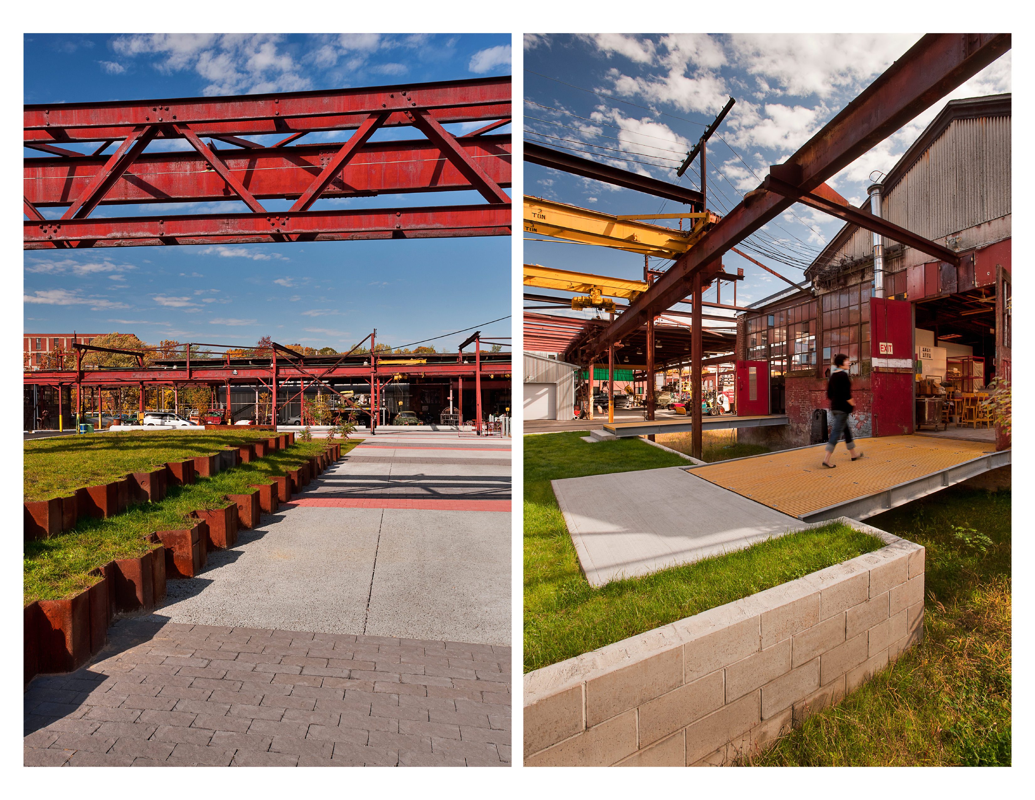
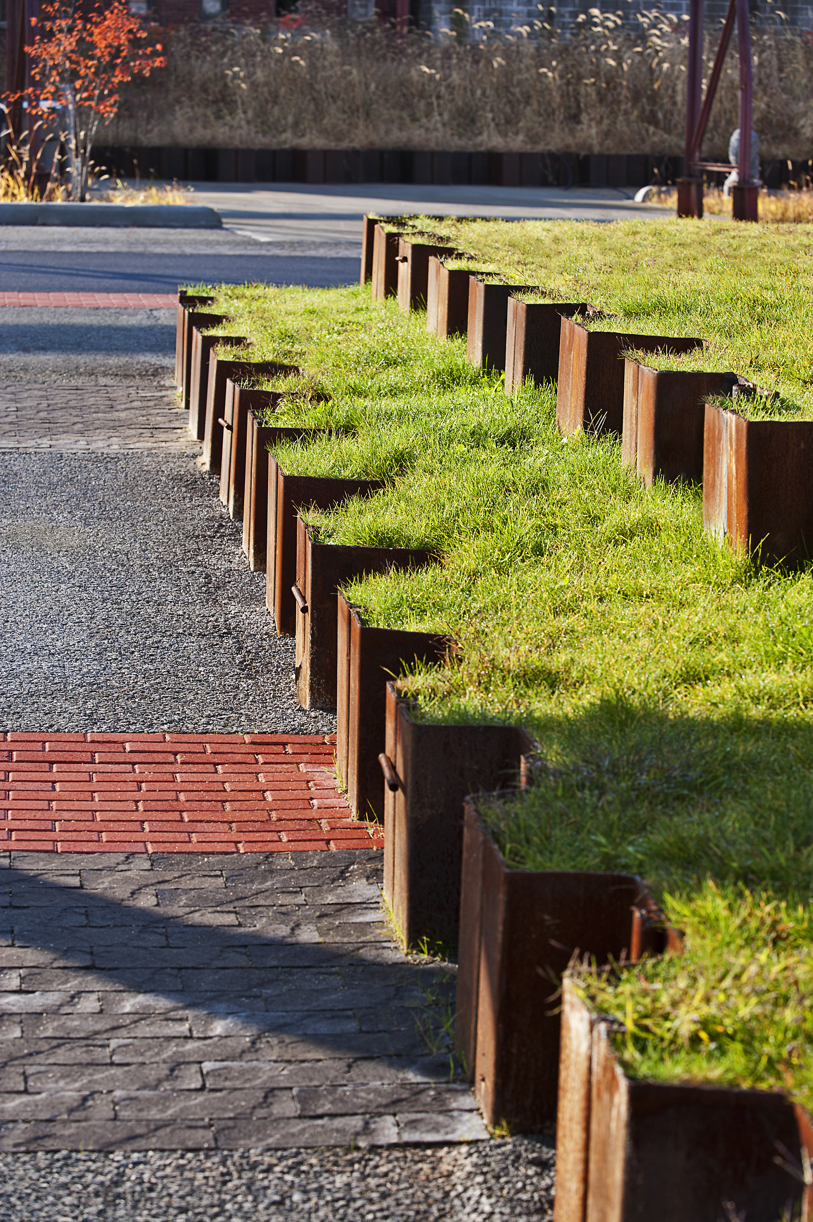
I'll be going through this years ASLA winners in more detail soon to pull out the great details on the projects.
And finally, I did say it was a short week, an illustration for brewing company. What made me pull this out is not so much the image, but the drawing technique made to look as the image is on burlap or a course paper. It reminds me how much the medium can change how something looks. What would an image look like on steel, or concrete, or glass. The same idea can be created many different ways with different materials. Something I try to keep in my mind.

Have a great week.
G.
Sunday, 25 September 2011
Weekly Image Roundup
The Friday Roundup is changing to the Weekly Image Roundup. I never seemed to be able to get the images up in time, and besides, I'm still finding great images on Friday that never make the cut.
So here we go...
This weeks pick. My favourite is this water access to Jack Evans Boat Harbour, designed by ASPECT Studios. Repeating patterns of concrete forms creating steps to the water. Really nice. Reminds me a little of the water access at False Creek Olympic Village in Vancouver.

And here's the rest of last week's for your visual interest! First the directly related LA items.


Right, work by artist Dolan Geiman This cutout is a technique that can be easily used for signage features. It reminds me of signing in the Mount Pleasant Square in Brampton, shown to the left, and below. I'm thinking of different materials behind the cutout could really make things interesting.
And a few more.
 And.
And.

Many of the links this week were from World Landscape Architecture and Design Sponge. Two of my sources for a lot of good stuff.
All images old and new are here. Have a great week.
G.
So here we go...
This weeks pick. My favourite is this water access to Jack Evans Boat Harbour, designed by ASPECT Studios. Repeating patterns of concrete forms creating steps to the water. Really nice. Reminds me a little of the water access at False Creek Olympic Village in Vancouver.

And here's the rest of last week's for your visual interest! First the directly related LA items.
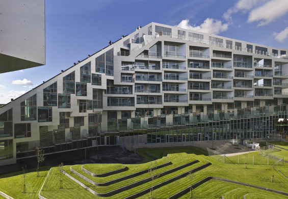
Some contour forms from Denmark.
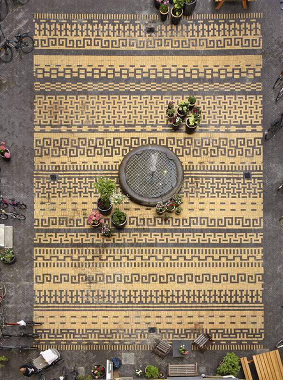
Great intricate paving pattern from a courtyard in Copenhagen.

Amazing bench by artist Alexandre Moronnoz in France. He has another bench with is also pretty amazing here.
Next, the broader design range.


And a few more.
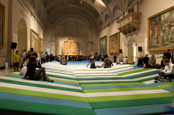

Many of the links this week were from World Landscape Architecture and Design Sponge. Two of my sources for a lot of good stuff.
All images old and new are here. Have a great week.
G.
Wednesday, 21 September 2011
Paving Patterns
I am very weak towards modern clean pavers. Large grey pavers with long clean lines constantly draw me in. However, I'm starting to open up to intricate paving patterns. It make's me think of Laurie Olin's paving designs for his large plazas.


I've been getting a lot of inspiration from other mediums that make me want to try paving like this. I haven't decided if it could be considered dated or not. Or maybe it's time for it to come back. Or more likely it never went out of style. It would be a great contrast to a simple modern paving scheme, using both in the same project. Here are some of the images that make me think 'paving pattern'. Maybe one day I will get the chance.


These three are from Design Sponge where I constantly see interesting stuff.
UPDATE
Found this amazing paving for a courtyard. Very intricate paving.

Here's one from Seattle.

And one from his newer projects, Simon and Helen Director Park in Portland.
I remember Olin explaining in a lecture how he found inspiration for these patterns from woven baskets in his office.
I've been getting a lot of inspiration from other mediums that make me want to try paving like this. I haven't decided if it could be considered dated or not. Or maybe it's time for it to come back. Or more likely it never went out of style. It would be a great contrast to a simple modern paving scheme, using both in the same project. Here are some of the images that make me think 'paving pattern'. Maybe one day I will get the chance.


These three are from Design Sponge where I constantly see interesting stuff.
UPDATE
Found this amazing paving for a courtyard. Very intricate paving.
Sunday, 18 September 2011
Universal Design
I am a great believer in universal design. The design principles for all design is the same. Look for these in graphic design, furniture, industrial design, interior design, architecture and landscape architecture. Know design. Continue to learn design for your full career and look towards all creative industries for inspiration. I try to follow this simple rule of mine.
Take the new EQ3 catalogue I was recently flipping through. This couch drew my eye.

 I'm not even going to touch the symmetry of the couch. For another day. But let's take those lines and transform them into something that landscape architects will design. A bench. Here's a quick sketch of a bench that I've seen around. I've also seen this design as a coffee table.

Clean lines broken down into thirds to make a clean good looking bench. The bench could be even closer to the couch if the arms were pulled to edge and maybe a back was added.
Find these universal design principles everywhere. It will make a difference in how you look at design.
Take the new EQ3 catalogue I was recently flipping through. This couch drew my eye.

Along with the clean lines which is a person favourite, it made me think about proportions. What works? As always there's the golden rule of thirds that is a good one. It's a quick sketch but here's a breakdown of the some of the lines that drew my eye.


Clean lines broken down into thirds to make a clean good looking bench. The bench could be even closer to the couch if the arms were pulled to edge and maybe a back was added.
Find these universal design principles everywhere. It will make a difference in how you look at design.
Friday, 15 July 2011
Friday Image Roundup
Lots of good stuff this week, but my favorites are these info graphics. It can be such a fine art to make good looking diagrams or drawings that also convey the information you want to get across.
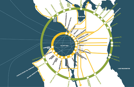
Here's my favourite for the Seattle Waterfront Park Design by James Corner Field Operations. I especially like simple colour scheme.

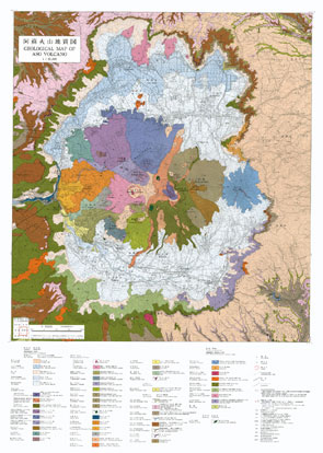
And here's a great volcano map image. Feels like it's ready to frame and hang on the wall.

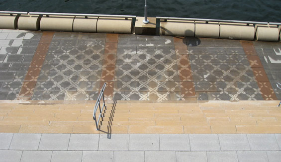
This came in a close second. I like patterns in the landscape and using them in such an ingenious way. I want to be able to do something like this one day. It's by PEG who have done similar work like this with planting patterns. Also very cool.

And here's the rest of the inspirational mix for this week. Have a great weekend.


Here's my favourite for the Seattle Waterfront Park Design by James Corner Field Operations. I especially like simple colour scheme.
And here's a great volcano map image. Feels like it's ready to frame and hang on the wall.
This came in a close second. I like patterns in the landscape and using them in such an ingenious way. I want to be able to do something like this one day. It's by PEG who have done similar work like this with planting patterns. Also very cool.
And here's the rest of the inspirational mix for this week. Have a great weekend.


Subscribe to:
Posts (Atom)